# 学习SVG(十一)动画
# SVG中的动画
- 在SVG中动画是根据SMIL规范来进行开发的。
- SVG中有4个动画元素:
set实现延迟功能。在规定时间之后,修改某个属性的值。animate实现单属性的过渡动画。animateTransform用于实现transform变换动画。animateMotion实现路径动画,让SVG各个图形,沿着指定路径运动。
# set
- 常用属性:
attributeName属性名称。attributeType属性类型,参数CSS/XML/auto。默认值auto。to变化到的值。begin延迟时间。
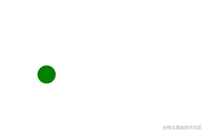
<circle cx="100" cy="100" r="100" fill="green" stroke="none">
    <set attributeName="cx" to="160" begin="2s" />
</circle>
1
2
3
2
3

# animate
- 常用属性:
attributeName属性名称。attributeType属性类型,参数CSS/XML/auto。默认值auto。from属性开始值。to属性结束值。dur动画过渡时间。repeatCount动画重复次数。设置为 indefinite 表示无限循环,一直执行。fill动画结束后,freeze表示冻结,remove表示恢复。
<rect x="10" y="10" width="200" height="200" stroke="green" fill="none">
    <animate attributeName="width" attributeType="XML" from="200" to="20" dur="5s" repeatCount="2"></animate>
</rect>
1
2
3
2
3

# animateTransform
- 常用属性:
attributeName属性名称。attributeType属性类型,参数CSS/XML/auto。默认值auto。repeatCount动画重复次数。typetransform变换类型。
<rect x="-10" y="-10" width="40" height="40" fill="ff9">
    <animateTransform
      attributeType="XML"
      attributeName="transform"
      type="scale"
      from="1"
      to="4"
      dur="3s"
      fill="freeze"
    ></animateTransform>
</rect>
1
2
3
4
5
6
7
8
9
10
11
2
3
4
5
6
7
8
9
10
11
# animateMotion
- 常用属性:
attributeName属性名称。attributeType属性类型,参数CSS/XML/auto。默认值auto。path定义路径。dur动画过渡时间。
<circle cx="10" cy="10" r="15" fill="green" stroke="none">
    <animateMotion path="M50,135C100,25 150,225 200,125" dur="6s" fill="freeze"></animateMotion>
</circle>
1
2
3
2
3
# CSS操作SVG动画
- 在内联模式下,
SVG元素作为html标签。直接成为DOM的一部分,我们就能使用CSS直接控制。
# 简单使用
...
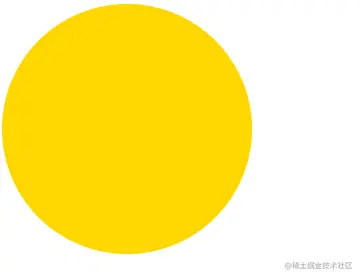
#cir {
fill: gold;
}
#cir:hover {
fill: greenyellow;
}
...
<circle id="cir" cx="100" cy="100" r="100" fill="green" stroke="none"></circle>
...
1
2
3
4
5
6
7
8
9
10
11
12
2
3
4
5
6
7
8
9
10
11
12
# 时钟动画
<style type="text/css">
    .fast-line {
      animation: rotateName 2s linear infinite;
    }
    .slow-line {
      animation: rotateName 15s linear infinite;
    }
    @keyframes rotateName {
      0% {
        transform: rotate(0deg);
      }
      100% {
        transform: rotate(360deg);
      }
    }
</style>

...

<svg height="100" width="100" viewBox="-52 -52 104 104">
  <circle fill="none" stroke="#DE3E35" stroke-width="6" stroke-miterlimit="10" cx="0" cy="0" r="48" />
  <line
    class="fast-line"
    fill="none"
    stroke-linecap="round"
    stroke="#DE3E35"
    stroke-width="6"
    stroke-miterlimit="10"
    x1="0"
    y1="0"
    x2="35"
    y2="0"
  ></line>
  <line
    class="slow-line"
    fill="none"
    stroke-linecap="round"
    stroke="#DE3E35"
    stroke-width="6"
    stroke-miterlimit="10"
    x1="0"
    y1="0"
    x2="0"
    y2="24"
  ></line>
</svg>
1
2
3
4
5
6
7
8
9
10
11
12
13
14
15
16
17
18
19
20
21
22
23
24
25
26
27
28
29
30
31
32
33
34
35
36
37
38
39
40
41
42
43
44
45
46
2
3
4
5
6
7
8
9
10
11
12
13
14
15
16
17
18
19
20
21
22
23
24
25
26
27
28
29
30
31
32
33
34
35
36
37
38
39
40
41
42
43
44
45
46

- 先创建一个静态的时钟。这里要注意使用了
viewBox修改了可视区位置,因为SVG的旋转是整个坐标系旋转,所以已坐标原点为中心进行绘制。 - SVG元素也在DOM中,使用类选择器选中
line元素。 - 开始使用CSS的动画属性
animation。不断的修改line元素的rotate角度,完成长短针的旋转。
# 总结
本文主要了解了SVG的动画和结合CSS实现动画。除了CSS实现动画,通过JavaScript也能实现动画。当然需要分析一下动画的复杂度,简单的动画完全没必要使用JavaScript。