# Echarts概念
# 术语速查
通过官方提供的术语速查网站,可快速查找配置项名词
# 主题样式
通过Echarts主题编辑器编辑并导出主题JSON文件
# dataset(数据集)
# 1.映射数组形式
  dataset: {
    source: [
      ['product', '2012', '2013', '2014', '2015'],
      ['Matcha Latte', 41.1, 30.4, 65.1, 53.3],
      ['Milk Tea', 86.5, 92.1, 85.7, 83.1],
      ['Cheese Cocoa', 24.1, 67.2, 79.5, 86.4]
    ]
  }
2
3
4
5
6
7
8
# 2.对象数组形式
  dataset: {
    // 用 dimensions 指定了维度的顺序。直角坐标系中,如果 X 轴 type 为 category,
    // 默认把第一个维度映射到 X 轴上,后面维度映射到 Y 轴上。
    // 如果不指定 dimensions,也可以通过指定 series.encode
    // 完成映射,参见后文。
    dimensions: ['product', '2015', '2016', '2017'],
    source: [
      { product: 'Matcha Latte', '2015': 43.3, '2016': 85.8, '2017': 93.7 },
      { product: 'Milk Tea', '2015': 83.1, '2016': 73.4, '2017': 55.1 },
      { product: 'Cheese Cocoa', '2015': 86.4, '2016': 65.2, '2017': 82.5 },
      { product: 'Walnut Brownie', '2015': 72.4, '2016': 53.9, '2017': 39.1 }
    ]
  },
2
3
4
5
6
7
8
9
10
11
12
13
# 3.数据转换
数据转换器"filter"
此处的transform使数据根据Year属性名分成了2011、2012、2013三个组,效果如下图所示
dataset: [
    {
        source: [
            ['Product', 'Sales', 'Price', 'Year'],
            ['Cake', 123, 32, 2011],
            ['Cereal', 231, 14, 2011],
            ['Cake', 143, 30, 2012],
            ['Cereal', 201, 19, 2012],
            ['Cake', 153, 28, 2013],
            ['Cereal', 181, 21, 2013]
        ]
    },
    {
        transform: {
            type: 'filter',
            config: { dimension: 'Year', value: 2011 }
        }
    },
    {
        transform: {
            type: 'filter',
            config: { dimension: 'Year', value: 2012 }
        }
    },
    {
        transform: {
            type: 'filter',
            config: { dimension: 'Year', value: 2013 }
        }
    }
]
2
3
4
5
6
7
8
9
10
11
12
13
14
15
16
17
18
19
20
21
22
23
24
25
26
27
28
29
30
31

数据转换器"sort"
此处的transform根据score属性排序、排序方式为asc,效果如图所示
dataset: [
    {
        dimensions: ['name', 'age', 'profession', 'score', 'date'],
        source: [
            [' Hannah Krause ', 41, 'Engineer', 314, '2011-02-12'],
            ['Zhao Qian ', 20, 'Teacher', 351, '2011-03-01'],
            [' Jasmin Krause ', 52, 'Musician', 287, '2011-02-14'],
            ['Li Lei', 37, 'Teacher', 219, '2011-02-18'],
            [' Karle Neumann ', 25, 'Engineer', 253, '2011-04-02'],
            [' Adrian Groß', 19, 'Teacher', null, '2011-01-16'],
            ['Mia Neumann', 71, 'Engineer', 165, '2011-03-19'],
            [' Böhm Fuchs', 36, 'Musician', 318, '2011-02-24'],
            ['Han Meimei ', 67, 'Engineer', 366, '2011-03-12']
        ]
    },
    {
        transform: {
            type: 'sort',
            // 按分数排序
            config: { dimension: 'score', order: 'asc' }
        }
    }
]
2
3
4
5
6
7
8
9
10
11
12
13
14
15
16
17
18
19
20
21
22
23

转换器支持外部引入
// 首先要注册外部数据转换器。
echarts.registerTransform(ecStatTransform(ecStat).regression);

option = {
    dataset: [
        {
            source: rawData
        },
        {
            transform: {
                // 引用注册的数据转换器。
                // 注意,每个外部的数据转换器,都有名空间(如 'ecStat:xxx','ecStat' 是名空间)。
                // 而内置数据转换器(如 'filter', 'sort')没有名空间。
                type: 'ecStat:regression',
                config: {
                    // 这里是此外部数据转换器所需的参数。
                    method: 'exponential'
                }
            }
        }
    ],
    xAxis: { type: 'category' },
    yAxis: {},
    series: [
        {
            name: 'scatter',
            type: 'scatter',
            datasetIndex: 0
        },
        {
            name: 'regression',
            type: 'line',
            symbol: 'none',
            datasetIndex: 1
        }
    ]
};
2
3
4
5
6
7
8
9
10
11
12
13
14
15
16
17
18
19
20
21
22
23
24
25
26
27
28
29
30
31
32
33
34
35
36
37
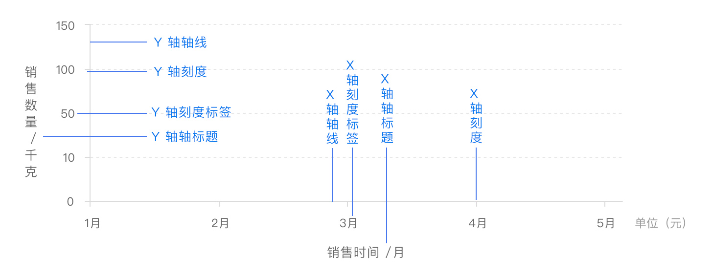
# 坐标轴
配置属性 xAxis yAxis
option = {
  tooltip: {
    trigger: 'axis',
    axisPointer: { type: 'cross' }
  },
  legend: {},
  //x轴设置
  xAxis: [
    {
      type: 'category',
      axisTick: {
        alignWithLabel: true
      },
      data: [
        '1月',
        '2月',
        '3月',
        '4月',
        '5月',
        '6月',
        '7月',
        '8月',
        '9月',
        '10月',
        '11月',
        '12月'
      ]
    }
  ],
  //y轴设置
  yAxis: [
    {
      type: 'value',
      name: '降水量', //轴线名称
      min: 0, //轴线最小值
      max: 250, //轴线最大值
      position: 'right', //降水量位置设置在右边
      //设置轴线文字label相关
      axisLabel: {
      	//格式化文本
        formatter: '{value} ml'
      }
    },
    {
      type: 'value',
      name: '温度',
      min: 0,
      max: 25,
      position: 'left', //温度位置设置在左边
      axisLabel: {
        formatter: '{value} °C'
      }
    }
  ],
  series: [
    {
      name: '降水量',
      type: 'bar', //降水量设置为条形图
      yAxisIndex: 0,
      data: [6, 32, 70, 86, 68.7, 100.7, 125.6, 112.2, 78.7, 48.8, 36.0, 19.3]
    },
    {
      name: '温度',
      type: 'line', //温度设置为线性图
      smooth: true,
      yAxisIndex: 1,
      data: [
        6.0,
        10.2,
        10.3,
        11.5,
        10.3,
        13.2,
        14.3,
        16.4,
        18.0,
        16.5,
        12.0,
        5.2
      ]
    }
  ]
};
2
3
4
5
6
7
8
9
10
11
12
13
14
15
16
17
18
19
20
21
22
23
24
25
26
27
28
29
30
31
32
33
34
35
36
37
38
39
40
41
42
43
44
45
46
47
48
49
50
51
52
53
54
55
56
57
58
59
60
61
62
63
64
65
66
67
68
69
70
71
72
73
74
75
76
77
78
79
80
81
82
83

# 图例
图例是图表中对内容区元素的注释、用不同形状、颜色、文字等来标示不同数据列,通过点击对应数据列的标记,可以显示或隐藏该数据列。图例虽然不是图表中的主要信息、却是了解图表信息的钥匙。
属性名: legend
legend: {
    type: 'scroll',
    orient: 'vertical',
    right: 10,
    top: 20,
    bottom: 20,
    data: ['图例一', '图例二', '图例三' /* ... */, , '图例n'],
    //控制当前图例显示隐藏
    selected: {
      图例一: true,
      图例二: true,
      图例三: false
    }
},
2
3
4
5
6
7
8
9
10
11
12
13
14

# 事件与行为
在
Apache ECharts的图表中用户的操作将会触发相应的事件。开发者可以监听这些事件,然后通过回调函数做相应的处理,比如跳转到一个地址,或者弹出对话框,或者做数据下钻等等。
ECharts中的事件名称对应 DOM 事件名称,均为小写的字符串,如下是一个绑定点击操作的示例。
myChart.on('click', function(params) {
  // 控制台打印数据的名称
  console.log(params.name);
});
2
3
4
# 鼠标事件的处理
1.支持常规的鼠标事件类型,包括
'click'、'dblclick'、'mousedown'、'mousemove'、'mouseup'、'mouseover'、'mouseout'、'globalout'、'contextmenu'事件。2.所有的鼠标事件包含参数
params,这是一个包含点击图形的数据信息的对象,如下格式:
type EventParams = {
    // 当前点击的图形元素所属的组件名称,
    // 其值如 'series'、'markLine'、'markPoint'、'timeLine' 等。
    componentType: string;
    // 系列类型。值可能为:'line'、'bar'、'pie' 等。当 componentType 为 'series' 时有意义。
    seriesType: string;
    // 系列在传入的 option.series 中的 index。当 componentType 为 'series' 时有意义。
    seriesIndex: number;
    // 系列名称。当 componentType 为 'series' 时有意义。
    seriesName: string;
    // 数据名,类目名
    name: string;
    // 数据在传入的 data 数组中的 index
    dataIndex: number;
    // 传入的原始数据项
    data: Object;
    // sankey、graph 等图表同时含有 nodeData 和 edgeData 两种 data,
    // dataType 的值会是 'node' 或者 'edge',表示当前点击在 node 还是 edge 上。
    // 其他大部分图表中只有一种 data,dataType 无意义。
    dataType: string;
    // 传入的数据值
    value: number | Array;
    // 数据图形的颜色。当 componentType 为 'series' 时有意义。
    color: string;
};
2
3
4
5
6
7
8
9
10
11
12
13
14
15
16
17
18
19
20
21
22
23
24
25
# 用代码控制饼状图轮流高亮
let currentIndex = -1;

setInterval(function() {
    var dataLen = option.series[0].data.length;
    // 取消之前高亮的图形
    myChart.dispatchAction({
        type: 'downplay',
        seriesIndex: 0,
        dataIndex: currentIndex
    });
    currentIndex = (currentIndex + 1) % dataLen;
    // 高亮当前图形
    myChart.dispatchAction({
        type: 'highlight',
        seriesIndex: 0,
        dataIndex: currentIndex
    });
    // 显示 tooltip
    myChart.dispatchAction({
        type: 'showTip',
        seriesIndex: 0,
        dataIndex: currentIndex
    });
}, 1000);
2
3
4
5
6
7
8
9
10
11
12
13
14
15
16
17
18
19
20
21
22
23
24
# 监听“空白处”的事件
有时候,开发者需要监听画布的“空白处”所触发的事件。比如,当需要在用户点击“空白处”的时候重置图表时。
在讨论这个功能之前,我们需要先明确两种事件。zrender 事件和 echarts 事件。
myChart.getZr().on('click', function(event) {
    // 该监听器正在监听一个`zrender 事件`。
});
myChart.on('click', function(event) {
    // 该监听器正在监听一个`echarts 事件`。
});
2
3
4
5
6
zrender 事件与 echarts 事件不同。前者是当鼠标在任何地方都会被触发,而后者是只有当鼠标在图形元素上时才能被触发。事实上,echarts 事件是在 zrender 事件的基础上实现的,也就是说,当一个 zrender 事件在图形元素上被触发时,echarts 将触发一个 echarts 事件给开发者。
有了 zrender 事件,我们就可以实现监听空白处的事件,具体如下:
myChart.getZr().on('click', function(event) {
    // 没有 target 意味着鼠标/指针不在任何一个图形元素上,它是从“空白处”触发的。
    if (!event.target) {
        // 点击在了空白处,做些什么。
    }
});
2
3
4
5
6